

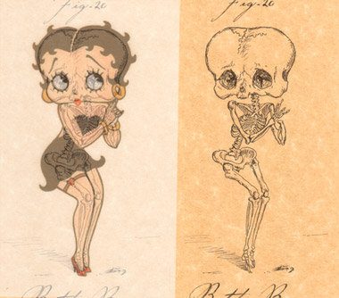


Se você
tivesse acreditado
na minha brincadeira
de dizer verdades
teria ouvido verdades que teimo
em dizer brincando
falei muitas vezes como o palhaço
mas nunca desacreditei
da seriedade da platéia
que sorria
Fred Maia
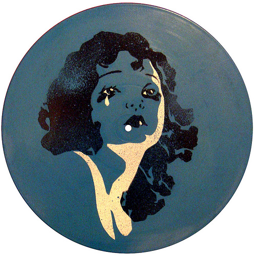

Art: EMEK
EMEK did the poster and its printed on Real Heavy Duty X-Ray Film!
post

Art: Clint Wilson
Post:
http://insidetherockposterframe.blogspot.com/2011/04/clint-wilsons-dinosaurs-art-prints-set.html
Schiller diagnosticava, precocemente, que os domínios da ciência se ampliavam, ao passo que os da arte se estreitavam.
Disso decorria uma desvalorização da arte e uma limitação da imaginação e da criatividade em prol de um excesso de racionalização, que restringia o homem ao reino da necessidade. Dessa forma, tolhido em sua liberdade, o homem perdia sua característica mais preciosa…
…a capacidade de alçar-se para além dos limites da realidade factual, afirmando sua liberdade por meio da criação de outras possibilidades.
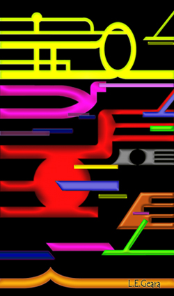
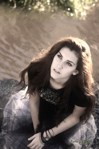
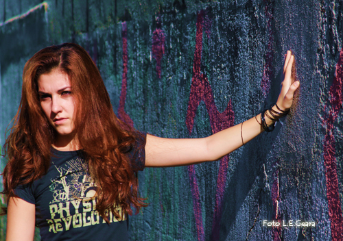
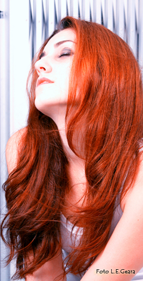
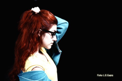
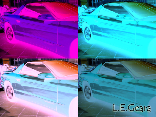
Pipes - L.E.Geara - 2009
Schiller jamais aceitou a máxima de que o povo tem um interesse artístico restrito ou de que certas obras mais refinadas destinam-se a poucos. Ao contrário, o gosto bem como a reflexão devem ser estimulados, ampliados e cultivados com obras superiores e cada vez mais complexas. Somente assim seria possível educar toda uma nova geração capaz de superar a crise de valores que se instaurava no mundo moderno.

Art: Kim Asendorf

Good typography is paramount to any good design.
An otherwise-beautiful design can really suffer if the typography choices are wrong. But combining fonts beyond the basic serif/sans-serif pairing can be tricky and confusing to a lot of designers.
While a lot of what goes into good typography is subjective, there are some guidelines that can point you in the right direction. From there, it’s up to you to experiment and try out different things.
Don’t be afraid to try new things in your typography, but trust your eye and your instincts as a designer. Sometimes, even things that follow all the “rules” of typography can still look awful (and vice versa).
Every typeface has a mood. Some are lighthearted and fun, some are serious, some are elegant, and some are very professional. Typefaces with similar moods are more likely to be compatible and less likely to be aesthetically jarring.
Take the examples below. The typefaces used on the left, Tahoma for the body copy and Snidely for the headline, don’t match up. Snidely is a decorative font with a quirky, funky look to it, while Tahoma is understated and modern. While they’re not the worst pairing in the world, they definitely aren’t optimal either.

The typefaces on the right, Neuton for the body copy and Nevis for the headline, both have similar casual moods. Neither is stuffy or overly formal, which makes them work well together despite being outwardly very different in appearance.
The letterforms that make up a typeface can be incredibly varied, based on a number of factors, like historical influence or overall style. Matching up these letterforms is a good way to find compatible typefaces, though generally you’ll also want to match them based on style or other factors as well.
One of the quickest ways to check compatible letterforms is to check the letters “a”, “g”, and “e”. In the example below, you can see how Aller and Gentium have similar letterforms, as do Helvetica and Museo. All four fonts have similar “a” letterforms. The “g” letterforms are where we see the biggest differences.

Other letters you might want to check include the lowercase “t” (some fonts will have a tail on the “t” while others won’t), lowercase “f” and lowercase “q”. Differences in letterforms aren’t necessarily a deal-breaker between fonts, but you’ll want fonts that have more similarities than differences in these cases.
The combination of a serif font and a sans-serif font is probably one of the most commonly seen typographical combinations. It’s a relatively easy combination to pull off, as there’s less chance for conflict. As long as you pay attention to weight and proportion, it’s a pretty difficult combo to get wrong.
The text below shows a couple of different ways to mix serif and sans-serif fonts. The example on the left shows that you can mix font weights if things like proportion are very similar. The headline font, ChunkFive, is a slab serif, while the body copy font, Junction, is a simple sans-serif. Both have strong visual styles, though, which prevents Junction from being overpowered.

The pairing on the right is a bit more traditional, with very similarly matched fonts. Junction is used as the headline font here, with Prociono for the body. Both are a bit on the thin side, and have similar letterforms.
If you’re combining a lot of really disparate fonts, try tying them together with color. Keeping everything in one color (or shades of a single color) adds harmony and unity that might be missing in the fonts themselves.
You can see from the image below that color can have a huge impact on the way typography looks. Both lines of text in the image below are identical, with the exception of the letter colors. While neither is what would typically be considered “good” typography, the top one could at least be made to work in the right context. The bottom one, however, looks like something a kindergarten student might design during coloring time.

It shows just how important using similar colors is, especially if you’re disregarding a lot of the other guidelines in this article. Conversely, if you’re looking to add a bit more contrast between typefaces that might be a little too similar, using different colors can do just that.

Using slightly different colors really adds visual interest to the typography here, which is made up of Fontin and Fontin Sans, two fonts from the same family that are nearly identical.
Proportion is probably the most important thing to consider, especially when combining typefaces in a single line (like in a header or logo). Fonts that are proportionally similar will blend more easily and look more uniform than fonts with varying proportions.
The quickest way to check proportion is by comparing x-heights. Generally speaking, fonts with similar x-heights will have similar proportions overall. In the image below, you can see that Helvetica and Neuton have virtually identical x-heights.

By contrast, the x-height of Bolton is much taller and Primer is much shorter than the other two fonts. Check other letters to be sure they’re compatible or incompatible, but x-height is a great place to start.
You’ll also want to look at the width of characters within the typeface. Check the width of wider characters like “m”, “w”, or “o”, as well as the narrower characters, like “t”, “f” and “j”. For the best compatibility, these letters should have similar widths between the two typefaces.
Fonts with radically different weights can work together, but it’s much more likely they’ll be compatible if the weights are similar.
The issue that’s most often present when fonts have radically different weights is that lighter fonts often get lost, visually, when paired with much heavier fonts. This becomes even more pronounced if the heavier font is being used for a headline, and the lighter font is body copy.
Look at the text below. The “headline” font here (Charlie Brown M54) completely overpowers the “body” font (TitilliumText14L Regular).

Increasing the font weight of the body font compensates for this. That’s always an option, though it can limit your options for using different styles in your design. It’s much simpler to find fonts that match up at different weights (so bold in one is equal to bold in the other, etc.).
There are a lot of typefaces out there that include multiple fonts within the same family. Typefaces like Fontin (and Fontin Sans) come with a handful of weights that can be combined to create a lot of visual interest.
Below is a great example of how different weights and styles can be used together to create typography that has plenty of visual interest. Because this is all based on one general font family, you don’t really have to worry about the different fonts conflicting with each other.

Contrast in typography is generally a good thing. The point of using different fonts is so that they stand out from one another, contributing to the overall visual style of a design. If your fonts are too similar, they conflict with each other, rather than contrast and complement.
Take the examples below. In the first line, the fonts are very similar (Hoefler Text and Goudy Bookletter 1911). Any contrast is lost, and instead, they look a bit strange next to each other.

The second line is better, with ChunkFive and Geneva. They have similar proportions, but that’s pretty much where the similarities end. There’s good contrast here.
The third line, on the other hand, shows why just using different fonts doesn’t necessarily result in good contrast. This is why it’s important to pay attention to more than just one aspect of combining typefaces.
Radical contrast between typefaces can be a great way to add visual interest to a design. This doesn’t necessarily mean you can just throw any two fonts together and hope for the best. You still need to keep in mind general principles of typography, and then pick and choose which guidelines you want to adhere to and which ones you want to disregard.
The easiest way to create typographic designs that use radically different fonts is to keep proportion in mind. Pay attention to the overall shape on the fonts and things like x-height, and then play around from there.
You may need to adjust the sizes of different characters if combining a number of different typefaces, as not all typefaces are consistent when it comes to sizing. Look at the two examples below:

The top line uses a wide variety of fonts, but they’re all grunge or destructed fonts. This gives them a common style and unites them, even though proportion and weight are different between characters.
The bottom line, though, uses only three typefaces, two of which are sans-serif and one of which is serif. These fonts have a number of things in common, though. First of all, they’re all relatively heavy. Using the heaviest for the shortest part, and the lightest for the longest part, helps balance them visually. The line widths are also uniform in each font, with no deviation either between letters or within letters themselves. Finally, all three fonts have fairly wide, round letter shapes.
To a large extent, combining fonts in this manner is subjective, but keeping in mind what makes a good typographic design can help point you in the right direction when you start designing things like this.
Written exclusively for WDD by Cameron Chapman.
http://www.webdesignerdepot.com/2011/02/eight-ways-to-combine-typefaces/

Curitiba - PR

Paranaguá - PR

Baía de Paranaguá - PR

Ilha das Cobras - PR

Lee Miller
Miller was at home in front of and behind the camera. She began modelling, aged 19, in New York, posing for, among others, the great Edward Steichen. At 22, she began working as an assistant to Man Ray in Paris, becoming his lover, creative collaborator and muse. Picasso, too, fell briefly under her spell, painting five portraits of her. Later, she married Roland Penrose, the surrealist painter, who, in Night and Day, portrayed her as a kind of floating goddess in the sky. Since her death, Miller’s reputation has grown. She is now regarded as a great photographer who also happened to be a muse

Sara Lowndes
Like many great artists, Bob Dylan has had many muses, from the passing fancy that was Edie Sedgwick (also a muse to Andy Warhol) to his first long-term girlfriend, Suze Rotolo, who appeared with him on the cover of The Freewheelin’ Bob Dylan. His ex-wife, Sara, though, stands out even in this exalted company. “Stayin’ up for days in the Chelsea Hotel/ Writin’ ‘Sad-Eyed Lady of the Lowlands’ for you,” he sang on his ode to her on 1976’s album, Desire. Though Dylan denies it, his album of the previous year, Blood on the Tracks, is a series of heart-wrenching missives to his great lost love and abiding muse

Renée Perle
The photographer Jacques Henri Lartigue was no stranger to beauty, but the Romanian-born model Renée Perle captivated him – and his camera – like no other. In image after image, he paid homage to her style, elegance and great beauty, taking him with her as his mistress/muse as he roamed the rich holiday spots of Cannes and Biarritz in the 1930s. He seems to have literally regarded her as his angel, around whom, he once said: “I see a halo of magic.” More recently, she was cited as an inspiration for a collection by the fashion designer John Galliano

Maud Gonne
William Butler Yeats’s unrequited love for Maud Gonne was a subject that recurred in his poetry. The 22-year-old first met Yeats in London in 1889, and, though they spent the following nine evenings together, she steadfastly refused to reciprocate his feelings. He continued to write poetry to her even after her marriage to Major John MacBride, and even proposed to her again after her husband’s death in 1916. “Why should I blame her that she filled my days with misery…?” he wrote of the aristocratic beauty and fervent Irish nationalist who enthralled, dismayed and inspired him throughout his life

Catherine Deneuve
Deneuve is a very modern kind of muse: cool to the point of icy, almost detached in her sense of self-containment. Her particularly French charms – one part exquisite style icon, one part mysterious, unreadable beauty – made her a muse to both Luis Buñuel and Yves St Laurent, whose artistic temperaments could hardly be more different. In Deneuve, Buñuel saw something unreachable that made her the perfect foil for his wilfully perverse, but politically acute films. Dior saw her effortless elegance and timeless style. For over 30 years, she was the face of his label, a faithful muse who wore only his creations: the embodiment of a vision

Zelda Fitzgerald
Few literary muses have embodied an entire age as well as inspiring its most brilliant chronicler. Zelda Fitzgerald was the original wild child of the Roaring Twenties, who, in her own words “did not have a single feeling of inferiority, or shyness, or doubt, and no moral principles”. In all this, she was the arbiter not just of the modern age, but for all that has followed, from the cult of celebrity to the idea of the damaged beauty. She was the model for many of her husband F Scott Fitzgerald’s heroines. He once wrote of her: “Sometimes, I don’t know if Zelda and I are real or whether we are characters from one of my own novels.”

Gala Dalí
Born Elena Ivanovna Diakonova into a Russian intellectual family in 1894, she became lover, wife, and muse to the poet Paul Eluard in her early twenties. With him, she became a key figure in the surrealist movement, inspiring Louis Aragon, André Breton and Max Ernst. For Breton, she became an emotional tormentor and he later claimed to despise her. She met Salvador Dalí, 10 years her junior, in 1929, and became his lifelong muse, inspiring many of his paintings and, according to him, saving him from insanity. Despite her many affairs, he portrayed her as the Blessed Virgin and exalted her in several quasi-religious portraits

Alice Liddell
The child muse of Charles Dodgson (Lewis Carroll), 10-year-old Alice Pleasance Liddell was the inspiration for Carroll’s Alice’s Adventures in Wonderland after he spent a “golden afternoon” on 4 July 1862 with Alice and her sisters on a picnic, inventing stories to amuse the children. He also photographed her many times, famously as a beggar child, a portrait that merges fantasy and seriousness in a still slightly disturbing way. The nature of Dodgson’s friendship/infatuation with Liddell has become a source of some thorny debate since, but, suffice to say, without Liddell, there would have been no Alice.
http://www.guardian.co.uk/culture/gallery/2011/jan/23/ten-best-artisic-muses-in-pictures